 IB Docs (2) Team

Textbook approach to the new IB Economics examination specification

This chapter from the Economics textbook sets out how the assessment model from the new specification is used in the textbook. This is primarily the way questions with markscheme answers are used in each inquiry case example in the textbook. The new IB examination also emphasises the importance of real-world examples to support student answers to examination questions and there are over 130 real-world examples on all aspects of the syllabus in the textbook.
This chapter sets out how the changes to the external assessment model in Economics are used in the IB examination style questions included with each inquiry case example. Exam inquiry case examples come with questions based on HL and SL Paper 1 and Paper 2 along with questions for HL Paper 3.
The framework of the new Economics assessment model is the same as the previous model with three examination papers at HL and two examination papers at SL. The method of assessment in each examination paper is similar to the previous approach:
- Paper 1 HL and SL is an extended response (essay) paper
- Paper 2 HL and SL is a data response paper
- Paper 3 HL (only) is a policy paper with a quantitative focus.
Here is a summary of the changes to the external assessment model:
Method of assessment | Changes to the previous specification |
Paper 1 HL and SL | |
|
|
Paper 2 HL and SL | |
|
|
Paper 3 HL only | |
|
|
IB Examination style paper 2
This case study on demand and supply, resource allocation, economic growth, aggregate demand and aggregate supply can be completed as a homework or class work exercise and should take around 95 minutes. It is based on a paper two examination question using the new syllabus. The maximum mark for this paper is 40.
The falling price of oil
Text A
When the Covid19 pandemic started to have a real impact on the global economy in the first quarter of 2020 the world price of oil collapsed. On 1 January, the oil price was at just over
The last time oil prices fell as sharply was in 2008 following the global financial crisis. The key driving force in both 2020 and in 2008 was the falling demand for oil. As countries around the world went into lock-down both industrial and consumer demand for oil decreased. [Paragraph 2]
Text B
The market for petrol (gas) has been significantly affected by the fall in the oil price. Table 1 shows how the fall in oil price has affected the price and quantity of petrol (gas) sales in Russia from January to June 2020. [Paragraph 3]

The fall in petrol (gas) prices was certainly good news for Russian consumers, but they found it difficult to benefit from the lower oil price as government regulations limited the movement of people during the pandemic. The lower oil price also led to lower production costs for businesses. This was particularly true for industrial sectors where oil is a significant cost such as energy, transport, petrochemicals, and plastics. [Paragraph 4]
Text C
As a net oil exporter Russia has been hit particularly hard by the fall in oil price. Russian crude oil exports fell to less than
Text D
The fall in oil price in 2020 may have implications for the renewable energy sector. Fossil fuel energy and renewable energy are substitute goods. The growth of the renewable energy sector over the last few years has seen a significant switch in resources from fossil fuels to renewables. Although the fall in oil price might slow the growth of the renewable energy sector in the short term, in the long-term transition to wind and solar power seems relentless. [Paragraph 6]
Answer the following questions
a. Define the term demand. [Text A, paragraph 2] [2]
b. Using the price and quantity data in table 1 calculate the:
(i) Percentage change in the price petrol (gas) from January to April 2020. [1]
(ii) Percentage change in the quantity of petrol (gas) sold from January to April 2020. [1]
(iii) Price elasticity of supply of petrol. [2]
(iv) State whether the price elasticity of supply of petrol (gas) is elastic or inelastic. [1]
c. Using a demand and supply diagram explain the impact the falling oil price might have had on the market price and quantity of the petrochemicals market. [Text B, paragraph 4] [4]
d. (i) Using the data Chart 1 outline the phase of the business cycle the Russian economy is in during the last three quarters of 2020. [2]
(ii) Explain the impact the economic growth rate in Russia in the last three quarters of 2020 will have on the Russian government’s tax revenue. [Chart 1] [4]
(iii) Using an AD/AS diagram explain the impact falling oil export revenues might have had on Russia’s GDP. [4] [Text C, paragraph 5]
f. Using a PPC diagram, explain the change in resource allocation in the energy sector as the market for renewable energy grows and the market for fossil fuels declines. [4] [Text D, paragraph 6]
g. Using information from the text/data and your knowledge of economics, discuss the consequences for different stakeholders in the Russian economy of a fall world oil prices. [15]
Here are Inquiry case examples from each section of the syllabus with questions drawn from HL and SL Paper 1 and 2 along with questions from HL Paper 3.

The price of mobile phones has fallen dramatically since they were first released onto the consumer market in the United States in the early 1980s. The data in the table sets out the change in price and ownership of mobile phones from 1993 to 2013 in the US.
Questions
a. Define the term demand. [2]
Demand is the willingness and ability of consumers to pay a sum of money for a good or service at a given price and at a given point in time.
b. Outline the law of demand. [2]
The law of demand states that as the price of a good or service rises, the quantity demanded falls and as the price of a good falls, the quantity demanded rises.
c. Explain the income and substitution effects as the price of mobile falls from 1983 to 2003. [4]
The income effect shows that as the price of mobile phones has fallen from 1983 to 2003, they have become more affordable for consumers as their price accounts for a smaller proportion of consumer income.
The substitution effect shows how the fall in the price of mobile phones makes them relatively less expensive compared to substitute goods such as land-line phones which makes mobile phones more attractive to buy.
d. Explain two reasons that might account for the ownership of mobile phones increasing from 2003 to 2013 even though the price has increased. [4]
The ownership of mobile phones might have increased from 2003 to 2013 because the quality of the mobile phone has improved which makes the phone more attractive to buyers even though it is at a higher price. The iPhone offered more sophisticated features than the Blackberry such as touchscreen use and a better visual display.
e. Explain two reasons that might account for an increase in demand for mobile phones. [10]
Answers might include:
- Demand is the willingness and ability of consumers to pay a sum of money for a good or service at a given price and at a given point in time.
- The demand for mobile phones might have increased because of a fall in the price of complementary goods to mobile phones such as data and contract costs.
- The demand for mobile phones might have increased because mobile phones are a normal good and there are rising household incomes.
- The demand for mobile phones might have increased because the quality of the mobile phone has improved which makes phones more attractive to buyers.
- The demand for mobile phones might have increased because of changes in consumer tastes and preferences towards mobile phones which could have been affected by advertising and promotion.
- Each of these factors would have caused the demand for mobile phones to increase from D to D1 in the diagram.
- A real-world example of an increase in the demand for mobile phones such as the Apple iPhone.
Inquiry case example - Where are the happiest people?

According to last year’s World Happiness Report produced by the UN, Norway has been overtaken by Finland to become the happiest place to live on earth. The report also shines a light on the decline of the US as its people struggle with obesity, substance abuse and depression. The report shows how the US has fallen to 18th place down from 13th. Scandinavian countries dominate the chart, with Finland followed by Norway, Denmark and Iceland. Burundi is the unhappiest place in the world. The East African country is scarred by ethnic cleansing, civil wars, crime and political conflict.
The happiness report is an annual publication produced by UN Sustainable Development Solutions Network. It said all the Nordic countries scored highly on income, healthy life expectancy, social support, freedom, trust and generosity. The rankings are based on Gallup polls of self-reported well-being, as well as perceptions of corruption, generosity and freedom.
Questions
a. Explain how the World Happiness Report can be used to measure welfare in a country. [4]
The World Happiness Report is a survey of people in a country that asks respondents to rate their level of happiness on a scale of 1 - 10. The individuals who are part of the survey have to consider factors such as citizen engagement, communications, technology and diversity, etc when they are making their judgement about happiness. The index for each person who is part of the survey is then aggregated for the whole population of the country and a single value is used to measure happiness or welfare.
b. Outline what the Happy Planet Index measures. [2]
The Happy Planet Index measures the sustainable well-being of a nation’s population. It considers the welfare of a nation in terms of achieving sustainable lives for its citizens. The factors in the index are wellbeing, life expectancy, inequality and ecological footprint.
c. Using a real-world example, evaluate the view that real GNI per capita is the most effective way of measuring welfare in a country. [15]
Answers might include:
- Real GNI per capita is the gross national income adjusted for inflation divided by the population of the country.
- Welfare is the quality of life of the population.
- A high real GNI per capita can improve welfare in a country through higher household incomes, greater availability of goods and services, better public services like health and education, increased employment and better infrastructure.
- The circular flow of income diagram shows how high income, output and expenditure can lead to increased incomes and welfare.
- Finland is an example of how a high real GNI per capita can increase welfare.
Evaluation:
- There are weaknesses in real GNI per capita as an indicator of welfare such as income inequality, non-monetary factors that affect welfare, nature of goods produced by a country and changes in the quality of goods.
- There are alternative methods of measuring welfare more effectively such as HDI, World Happiness Report and the Happy Planet Index.
Inquiry case example - The plunging value of the Turkish Lira
 The value of Turkish has plunged since January losing more than 34% of its value against the dollar. It was at record lows in late trading on Thursday evening falling to 6.30 Turkish Lira to the Dollar. The fall in the value of the Lira has been triggered by a political crisis, with the American government threatening Turkey with tariffs. Turkey has also got a growing debt crisis which is causing portfolio investors to take funds out of the country.
A growing current account balance of payments deficit is adding to pressures on the currency. The falling value of the Turkish Lira is increasing inflationary pressure and Turkey's inflation rate has increased to 22%.
Questions
a. If the Turkish Lira falls from TL4.70 = $1 to TL6.30, outline why this is a depreciation in the value of the Turkish Lira against the US Dollar. [2]
The fall in the Turkish Lira from TL4.70 to TL6.30 means the cost of buying $1 rises from TL4.70 to TL6.30 which means the Turkish Lira is worth less relative to the US dollar.
b. Using the depreciation of Turkish lira from TL4.70 = $1 to TL6.30 calculate:
(i) The change in the US dollar price of exported Turkish Soybeans costing TL4.50 per Kg. [2]
(TL4.50 / TL4.70 = $0.96) - (TL4.50 / TL6.30 = $0.71) = $0.25 (decrease)
(ii) The change in the Turkish Lira price of imported US motorcycles into costing $15,000 per unit. [2]
($15,000 x TL6.30 = TL94,500) - ($15,000 x TL4.70 = TL70,500) = TL24,000 (increase)
c. Using an AD/AS diagram explain the effect a depreciation of the Turkish Lira might have on Turkey's rate of inflation. [4]
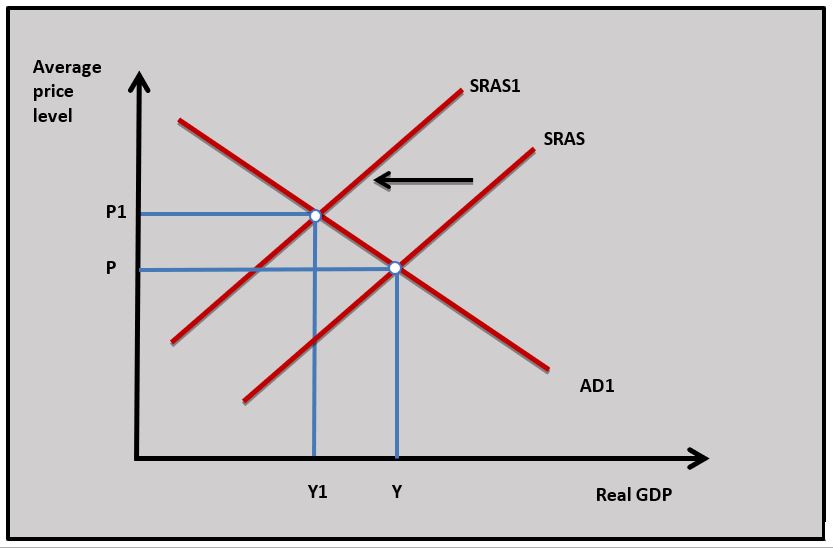 As the value of the Turkish Lira falls the cost of imports coming into the Turkish economy rises and this adds to the costs of Turkish business which causes SRAS to fall and the SRAS curve shifts to the left from SRAS to SRAS1 in the diagram. The rise in the average price level from P to P1 increases Turkish inflation.
d. Using an AD/AS diagram explain the effect a depreciation of the Turkish Lira might have on aggregate demand. [4]
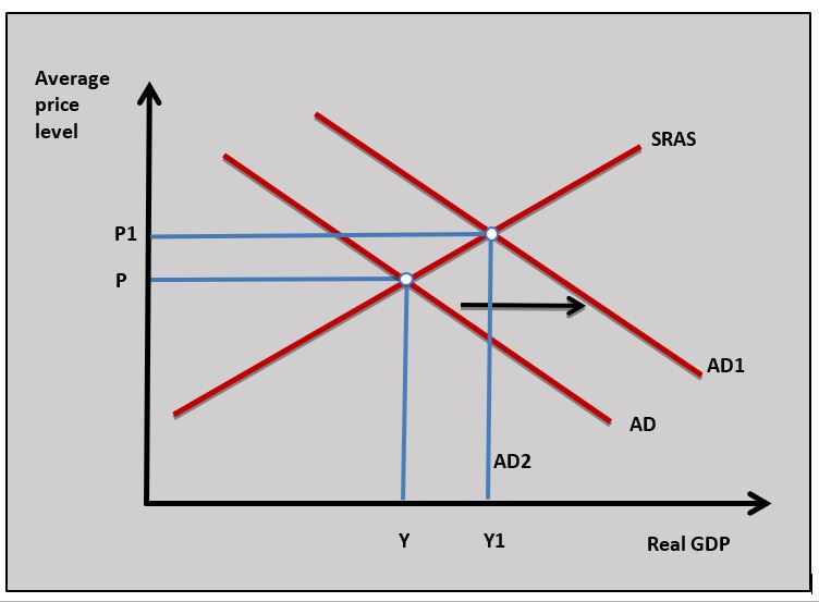 As the value of the Turkish Lira depreciates Turkey's export prices fall and its import prices rise which can lead to a rise in export revenues and fall in import expenditure. The rise in export revenues and fall in import expenditures leads to rise in net exports (X-M) which increases aggregate demand and this causes AD to shift to AD1 in the diagram.
 Twitter
 Facebook
 LinkedIn