 IB Docs (2) Team

A mathematical note about elasticity
 Introduction
Some of your students may question you about the shape of the demand and supply curves. In IB economics we always assume that demand and supply curves are drawn as a straight line. It is important that you reassure your class that it is perfectly acceptable for them to draw them this way. However, it is also good for your classes to understand that in reality demand and supply curves are actually curved. A fun exercise might be for your classes to practise drawing supply and demand curves as they should be.
Enquiry question
Why the price elasticity of demand and supply is not constant but instead varies along the supply and demand curve
Teaching notes:
Lesson time: 30 minutes
Learning objectives:
Explain, using the elasticity formulae, why the price elasticity of supply and demand varies along the supply / demand curve.
Lesson notes:
1 Opening activity - Explain the objective of the lesson, which is that while students can be expected to draw linear supply and demand curves and consistent elasticity is presumed, in reality the level of elasticity changes at different points along the supply and demand curve.
2. Processes - technical vocabulary - the students can learn the vocabulary and the relevant concepts by studying the handout that you will distribute. This contains practise questions and should take no longer than 10 minutes to read.
3. Practise activity - complete the activity attached to the handout. This should take around 20 minutes and includes a mathematical and graphing exercise. This would be similar in type to paper three exercises and so may not be appropriate for your SL students.
4. A short link to the assessment is attached, explaining where students can find mathematical calculations on elasticity in the IB exam paper three (HL only paper).
Class handout
A mathematical note about elasticity
It is normal for IB economics students to make the assumption that elasticity curves are linear i.e. that the PES / PED elasticity for any product is constant. In reality this is not the case and are only drawn as straight lines for simplicity to represent lines 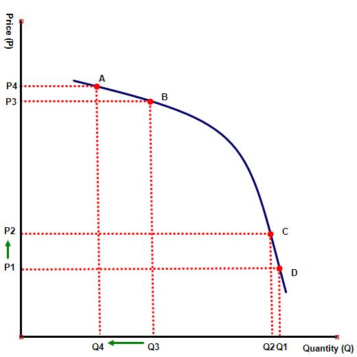 of best fit as the following diagrams illustrate.
Price elasticity of demand (PED)
From diagram 1, you can observe that the PED for any product actually falls as price falls and rises as the price increases. This is because low priced items are less PED elastic, since any change in the price will have a smaller impact on the consumer at lower prices than higher ones. For example a rise in the price of a good from $ 4 to $ 5 (25%) will have less significance than a similar % rise from $ 80 to $ 100. This is illustrated on diagram 1 where a rise in price of the good from P1 to P2 has only a minimal impact on quantity demanded − Q1 to Q2, where as a rise in price from P3 to P4 has a much larger impact, represented by Q3 to Q4.
Price elasticity of supply (PES)
Similarly, the supply curve is also non linear. This is because as more  factors of production are used up those resources used to make the goods and services become scarcer. As always in economics we make the assumption that the increasing scarcity of those resources will also tend to make those resources more expensive to obtain, raising production costs disproportionately. This means that supply will become less price elastic, at higher prices, as it becomes increasing difficult (and therefore more expensive) to obtain those resources at higher output levels, discouraging the entrepreneur from raising output levels.
This is illustrated on diagram 2, where at Q1, there are ample factors of production available, allowing firms to easily change production levels when the selling price changes.
As price rises, however, the resources needed for production become scarcer and the firms supply becomes less elastic – falling to <1 at Q2, P2.
Class notes available at: ![]() non linear supply curves
non linear supply curves
Practise questions (HL only)
(a) Complete the following table which illustrates the PED and PES for a product at different prices.
Price $ | Quantity supplied | Quantity demanded | PES | PED |
10 | 2,000 | 15,000 | - | - |
15 | 4,000 | 13,000 | 100 / 50 = 2 | 13.3 / 50 = 0.27 |
20 | 6,000 | 10,000 | 50 / 33 = 1.51 | 23 / 33 = 0.7 |
25 | 7,500 | 7,500 | 25 / 25 = 1 | 25 / 25 = 1 |
30 | 8,500 | 5,500 | 13.3 / 20 = 0.67 | 27 / 20 = 1.35 |
35 | 9,000 | 3,500 | 5.88 / 16 = 0.37 | 36 / 16 = 2.25 |
40 | 9,250 | 1,500 | 2.77 / 14 = 0.2 | 57 / 14 = 4.07 |
b. Illustrate the above information on a demand and supply diagram.
Link to the assessment
Mathematical calculations on the shape of the supply and or demand curve can be included on the paper three examination paper. Candidates may be asked to either graph a supply / demand curve from a set of given numerical data or be asked to provide an explanation as to why both curves are not linear.
 Twitter
 Facebook
 LinkedIn