 IB Docs (2) Team

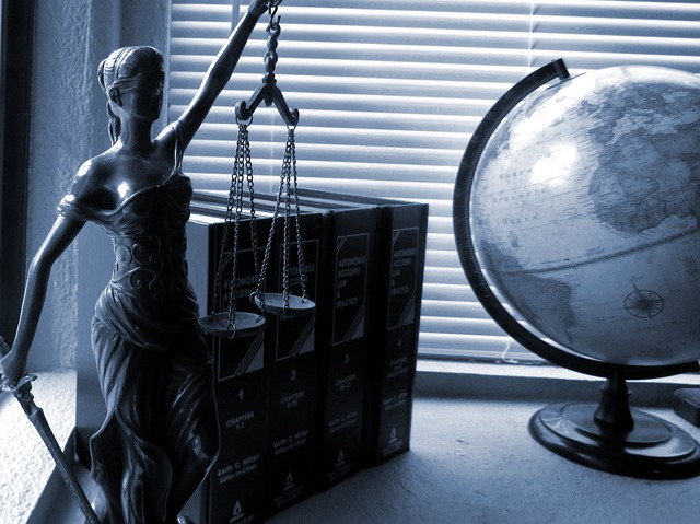
2017 Paper 1 (SL) Justice Hub (Part 2)
 This is the second post from the Standard Level May 2017 Paper 1 examination. You can find the text here (as seen online and not in the exact exam format). For the actual exam paper, you will need to contact your IB Coordinator.
The first exemplar, found here, was excellent and received top marks. It was very analytical of the visual elements found in the text. This one also follows a similar route, maintaining much focus on the images in the text. It just doesn’t do it as well. Why not? What’s the difference? What did the first writer do that the second writer didn’t or couldn’t?
Asking those questions and more is important when you provide this exemplar to your students. Comparing and contrasting these two exemplars with your students will also help them see two different approaches to a Paper 1. While both do well, one is clearly better than the other.
Sample Student Response
![]() May 2017 SL Paper 1 Exemplar 2
May 2017 SL Paper 1 Exemplar 2
May 2017 SL Paper 1 Exemplar 2
Justice is the underlying framework upon which modern civilization is built. Without justice, human progress as a collective would have stalled. Strong laws and their enforcement prevent government overreach and encourage nations to settle their differences in a civil fashion. The International Criminal Court is one such court which handles issues relating to wrongs done by governments or people on an international stage. Through the use of this infographic, its authors seek to explore the thematic idea of an evolving modern justice.
This begins with the author’s use of graphics to visualize change. This can be seen through the depiction of Justice with her balanced scales and blinded scaffold requiring a constant supply of fresh blood. This personification of justice uses the context of Lady Justice as a reader might imagine her to be and conveys the need for change with the minor modification of adding fresh blood via a drip. The author uses this to touch upon the idea that justice is constantly evolving in slow, incremental way. To the reader, provided with the context of elections for judges to the ICC, this informs us of the importance of these elections to ensure the incremental evolution of justice is done in the correct manner. This visual image of justice requiring change is aided by the subsequent graphic. The placement of the graphic beneath the one of Lady Justice emphasizes its important to the overall discussion. This is the graphic of a bent, old judge struggling under the load of a lot of cases, being helped by a younger justice who seems to be able to handle the load with lesser struggle. The visual representation of young helping the old is the author’s way of conveying the message of justice needing to evolve over time. This could be symbolic for how an older version of justice, as represented by the older judge, may struggle to deal with the nuance and complexity of modern cases that a more updated version of justice, as represented by the younger judge, might find easier to handle. Therefore, through the use of graphics, the author manages to emphasize the need for change in the ICC to a younger audience that is more accustomed to visuals as opposed to plain text.
The author proceeds to use techniques like changing text fonts and the attire of the characters in the graphics to represent changing times. This is evident in the first infographic that depicts a long list with the title “Rome Statute….Criminal Courts” As can be seen, the font type used is of a harder, more defined nature with sharper edges to the letters. This is juxtaposed to the information box laced adjacent to it discussing “in 1998 the Rome Statute…in 2002.” The font type used here is softer and the characters are less well-defined. This could be an attempt by the author to use subtext to indicate the evolution in justice over time. The more well-defined font in representative of a time where justice was a lot clearer and the division between right and wrong, as shown here by the division between the black of the letters and the white of the background was more clear and easier to distinguish. The softer, less well-defined (more rounded) modern font type is indicative of changing times, where laws require more nuance and subtlety and cases are harder to judge. Therefore, the author uses font types to re-emphasize the thematic idea of an evolving modern justice.
This is reaffirmed through the use of contrasting attire by characters in the same infographic. The visual is that of a man wearing older, more traditional clothes speaking out the laws of the Rome Statute that established the ICC. However, this is juxtaposed by the visual image of men in business suits signing the laws. The author is using the symbolism of changing attire to show how the Rome Statute was adopted at a different time than the countries which could adopt it today. This would therefore imply that as the times have changed but the laws haven’t, the laws require a more modern reinterpretation to keep up with the evolving times. Therefore, through the visual of attire in characters and font types, the author attempts to use symbolism to convey the message of changing times and static laws requiring a dynamic reinterpretation.
Furthermore, the author uses short sentences and text positioning to engage the reader and explain the need for change in the ICC in a manner that graphics cannot. The graphic artist may feel the need to ensure the correct interpretation of the visual images being presented as they are subject to wide interpretation. The use of text allows for a specific interpretation as the artist intended. This can be seen through the use of the phrase “fresh blood” in a text positioned next to the infographic depicting the blind Lady Justice. The drip and blood bag are there, but without the context provided by the phrase, the reader may not understand the author’s reasoning for the blood bag. Therefore, the author provides context for the graphic representations through the positioning and use of descriptive text. Another example of this is when the author provides a world map of countries with different colors. The legend provided uses short phrases like the color green being associated with the text “ICC members.” The short statements allow reader’s to quickly pick up on visual cues and look to the text for a glance to reaffirm their assumptions. This ensures that the audience’s attention is held by the infographic itself and not the text. Therefore, this helps keep the content engaging and holds the attention of younger audiences for longer periods of time, and thus, the author is to convey the message of modern justice more effectively through the use of this context.
Lastly, the author uses skin tone and accessories to emphasize diversity in age and ethnicity. This is evidenced by the use of color in the infographic depicting the 18 judges currently serving. The use of color in the infographic is effective as it shows the audience the diversity of ethnicities that the ICC represents. The juxtaposition of light and darker skin tones helps convey this message to the readers. In the mind of the reader it reaffirms the international nature of the ICC allowing their decision to be reflective of a more global interpretation of justice. This diversity is further emphasized by the use of oxygen masks and cobwebs indicating older justices. The infographic uses humor in this situation to make its point about the nature of diversity within the ICC and the need for change. This helps ensure that the evolution in justice is thoughtful and considered. The artist uses graphical representation to convey the need for justice to evolve; however, that evolution should be global and considered in nature.
Overall, the author effectively creates an infographic to visualize the need for justice to evolve. Font types and attire represent changing times and short phrases and text positioning provide the necessary context. The author has also depicted the nature of this change through color and humorous accessories all leading to the thematic idea of an evolving modern justice at the ICC.
Examiner's Comments
Criterion A - Understanding of the text - 5 marks
The analysis of the text should show an understanding of the text's purpose, its context (where this can be deduced) and a target audience. One's analysis of the text needs to be supported by relevant examples from the text.
4 out of 5: There is good knowledge of the texts and context with most of the claims supported with references from the text.
Criterion B - Understanding of the use and effects of stylistic features- 5 marks
The analysis of the text must show an awareness of how stylistic features, such as tone, style and structure, are used to construct meaning. A good analysis comments on effects of these features on its target audience.
4 out of 5: There is good awareness of the stylistic features with an adequate description of the effect on the reader. More close language analysis would have enhanced this response.
Criterion C - Organization and development - 5 marks
The analysis must contain coherent arguments that are well-developed. The analysis must be organized effectively.
4 out of 5: Generally, there is good organization and the argument is adequately developed.
Criterion D - Language - 5 marks
The language of the analysis must be clear, varied and accurate. The register of the analysis must be appropriate, meaning it contains formal sentence structure, good choice of words and effective terminology.
4 out of 5: The language is good with a secure structure. More varied vocabulary and sentence structure is needed though to move to the highest band.
 Twitter
 Facebook
 LinkedIn