 IB Docs (2) Team

BMT 7 - Descriptive statistics

Descriptive statistics are statistical tools used in Business Management to summarize and present statistical data in a user-friendly way. The purpose is to enable managers and decision makers to interpret and analyse the data more easily and to support them in making non-biased (rational), objective, evidence-based, and well-informed decisions. Examples of descriptive statistics include the use of the following methods:
Averages, i.e., mean, mode, and median measures of the average values in a data set
Graphical tools, such as bar charts, pie charts, and infographics to visually represent the data, and
Statistical measures of dispersion or spread of numbers in a data set, such as quartiles and standard deviation.
Case study - InThinking Business Management
As an example, here are some descriptive statistics from the InThinking Business Management website, benchmarked against the site average for all InThinking subject websites, as of 31st July 2023.
Table 1 - Selected benchmark data from InThinking subject websites
Data item | Business Management | Site average |
Registered schools | 991* | 749 |
Registered teachers | 1,886 | 1,598 |
Registered students# | 10,861 | 3,963 |
Free trials | 15 | 5 |
Percentage of teachers using Student Access | 38% | 23% |
Schools using Student Access | 52% | 39% |
Number of qBank questions (MCQ) | 1,976 | 573 |
Images / photos | 3,898 | 1,956 |
PDF documents | 405 | 608 |
Quizzes created | 1,554 | 1,545 |
Number of site pages | 933 | 794 |
Free pages | 14% | 11% |
Blogs | 63 | 97 |
Newsletter subscribers | 2,657 | - |
Number of words | 1,266,201 | 681,335 |
# Subscribing schools can activate Student Access for free, enabling all their students to access the website.
Table 2 - Countries with the highest number of subscribing schools to InThinking Business Management
| Ranking | Country | No. of schools |
| 1 | USA | 130 |
| 2 | China | 81 |
| 3 | India | 79 |
| 4 | Spain | 49 |
| 5 | Australia | 37 |
| 6 | United Arab Emirates | 32 |
| 7 | UK | 26 |
| 8 | Indonesia | 24 |
| 9 | Egypt | 23 |
| 10 | Canada | 21 |
The IB syllabus refers to the following eight descriptive statistical techniques:
(1) Mean
(2) Mode
(3) Median
(4) Bar charts
(5) Pie charts
(6) Infographics
(7) Quartiles
(8) Standard deviation
Note: The focus of this tool for business management teachers and students is to demonstrate how and why businesses use descriptive statistics to inform decision making. The focus is not on the mathematical techniques per se.
ATL Activity 1 (Thinking and Communication skills) - IB Diploma Exam Results
Discuss how school managers might make use of the following statistics for May centres in IB World Schools.
| Year | IB DP global average points | Global pass rate % | No. of students globally |
| 2022 | 31.98 | 85.60% | 173,878 |
| 2021 | 32.98 | 88.95 | 165,884 |
| 2020 | 31.34 | 85.18 | 170,335 |
| 2019 | 29.65 | 77.81 | 166,465 |
| 2018 | 29.76 | 78.18 | 163,173 |
| 2017 | 29.87 | 78.4 | 157,488 |
| 2016 | 29.95 | 79.3 | 149,446 |
The mean (also known as the arithmetic mean) is the main mathematical method used to calculate the average value in a data set. The mean calculates the sum of all the numbers in a data set divided by the number of items in that data set.
As an example, suppose five customers give the following ratings (out of 10) for the quality of service at a restaurant: 3, 4, 5, 6, and 7. The mean score or rating is calculated by adding all the numbers in the data set and dividing this by the number of items in the data set:
(3 + 4 + 5 + 6 + 7) / 5 = 25 / 5 = 5 out of 10.
As a second example, suppose a business has the following sales revenue figures for the past three years:
2022 = $240,000
2021 = $230,000
2020 = $220,000
The mean average is then calculated as:
($240,000 + $230,000 + $240,000) / 3 months = $230,000 per month.
Worked example 1
Suppose a restaurant chain has reported the following sales revenue for the first four months of this year:
Month | Sales revenue ($) |
Jan | 200,000 |
Feb | 180,000 |
Mar | 210,000 |
Apr | 200,000 |
Calculate the mean sales revenue for the restaurant chain. [2 marks]
Answer
To calculate the mean, first determine the sum of the sales revenues figures, i.e. $200,000 + $180,000 + $210,000 + $200,000 = $790,000
Then divide this figure by the number of items in the data set (four months) = $790,000 ÷ 4 = $197,500
Award [1 mark] for the correct answer and [1 mark] for showing appropriate working out.
Worked example 2
A firm produces four units of output at an average total cost (ATC) of $18. The firm subsequently makes a fifth unit of output which costs the firm $20. Calculate the value of the average total cost of the five units of output.
Answer
The total cost of producing four units = $18 × 4 =
$ 72.Adding the cost of a fifth unit at
$ 20 = $72 + $20 = $92Hence, the average total cost of producing five units =
$ 92 / 5 =$ 18.40.
Top tip!

Be careful when interpreting the mean average (or any measure of the average). Take the example of Tesla below:
2017 | 2018 | 2019 | 2020 | 2021 | |
Production* | 100,757 | 254,530 | 365,232 | 509,737 | 930,422 |
* Total number of vehicles produced
Source: adapted from Tesla Investor Relations
Calculating the mean average of the number of Tesla cars produced between 2017 - 2021 is straightforward:
100,757 + 254,530 + 365,232 + 509,737 + 930,422 = 2,160,678 vehicles
2,160,678 / 5 years = 432,136 vehicles per year
However, looking at the data, it is clear that between 2017 - 2019, production was significantly lower than the 5-year average. The output in 2021 is more than double the mean average, so this has skewed the result significantly.
ATL Activity 2 (Thinking and Communication skills) - IB Diploma exam results

Each year, the IB publishes a Statistical Bulletin which contains a wealth of data following the external examinations. This includes average point scores for each subject, each subject group, the Diploma Core (the Extended Essay and TOK)*, as well as world averages for the IB Diploma.
The data below are from the May 2022 examination session.
Mean subject score = 5.12
Mean total points = 31.98
IB Diploma pass rate = 85.85%
Mean score for Diploma Core = 1.53*
Candidates awarded 45 points = 0.74%
Candidates submitted Group 3 (Individuals and societies) Extended Essays = 46.13%
Business Management HL mean points = 5.24
Business Management SL mean points = 5.10
Source: adapted from IB Statistical Bulletin, May 2022
Discussion points:
How does your school compare with the data shown above?
Why might the rankings of an IB World School be regarded as important for certain stakeholder groups?
How might these descriptive statistics support the senior leadership of your school in relation to the organization's vision or mission statement?
Possible reasons could include:
The perceived reputation of the school in delivering a quality education.
The data can be used for benchmarking purposes, to see which subjects/departments are doing better than others and how this information can help everyone to improve. Benchmarking can be internal (comparing results of different subjects/departments) and/or external (comparing the quantitative measures against the performance of other IB World schools).
To determine areas for improvement (especially those measures that appear in the bottom quartile).
To hold teachers, subject coordinators, and departments accountable for their teaching and delivery of the IB syllabus.
To motivate students and staff to work harder and more efficiently in order to improve the organization's overall ranking based on measures such as those above.
Teachers can download a PDF version of this activity to use in class with their students.
3 Median average
The median is the average based on the middle value of the data set when a set of data is arranged in order of magnitude, i.e., it splits values in the higher half from those in the lower half. For example, suppose the five directors of a company earn the following salaries per year:
| $52,200 | $52,900 | $53,000 | $53,400 | $52,950 |
It is easier to place these values in ascending numerical order to help determine the median (middle) value:
| $52,200 | $52,900 | $52,950 | $53,000 | $53,400 |
This means that the average director of the company earns $52,950 per year based on the median average. There are two directors who earn more than the median, and two who earn less. In this particular case, using the median average might be more meaningful than the mean average. The latter gives a figure of $52,890 but we can clearly see that only one of the directors earns less than the mean average salary.

It can be useful for a business to know the median salary of its managers
Using the example from above for the modal average, for the 12 workers, we can calculate the median value.
| $3,200 | $2,900 | $3,000 | $3,400 | $2,950 | $2,900 |
| $2,850 | $3,000 | $2,900 | $3,150 | $3,250 | $3,300 |
Again, it is easier to put these values in numerical order so as to determine the median (middle) value:
$2,850, $2,900, $2,900, $2,900, $2,950, $3,000, $3,000, $3,150, $3,200, $3,250, $3,300, $3,400In this case, there are two middle value (shown in red above). The median value is the mid-point between the two numbers. In this case, as the two numbers are exactly the same, the median is simply $3,000.
The benefit of using the median average is that it reduces the significance of outliers. These extreme values can have a large impact on the mean average (arithmetic mean) but only a small impact, if any, on the median average.
4 Bar charts
Bar graphs are used to compare figures in a study, such as sales figures during different time periods. They are useful for presenting frequencies and for ease of comparison. The example below shows the sales of three different products (burgers, fries and drinks) for a restaurant chain with 4 outlets. The graph allows the restaurant owners to see at a glance which store has the highest sales for the various products it sells.

| Which restaurant has the highest sales revenue for burgers? | Restaurant 3 |
| Which restaurant has the highest sales revenue for fries? | Restaurant 1 |
| Which restaurant has the highest sales revenue for drinks? | Restaurant 3 |
| Which restaurant has sold more than $2,000 of fries? | Restaurant 1 |
| Which restaurant(s) sold less than $2,000 of drinks? | Restaurant 1 |
Histograms are a type of bar chart, used to show frequency and the range within a data set. The example below shows the distribution of IB grades for students of Business Management in a particular school. The grades (Levels 2 to 7) are shown along the x-axis, with the number of students achieving each of these grades shown on the y-axis. The school strives for all students to achieve at least a Level 4 target grade.

| How many students achieved a Level 2 grade? | 5 |
| How many students achieved a Level 7 grade? | 4 |
| How many students in total did not meet the school's target grade? | 5 + 11 = 16 |
| How many students in total achieved a Level 5 or Level 6 grade? | 24 + 9 = 33 |
Pie charts are used for expressing percentages, such as data on market share or the proportion of participants who chose a particular option in a survey. The pie chart below, for example, shows the percentage of candidates who chose to write their Extended Essay in a particular Diploma Programme subject group.

| Which subject group was the most popular for the Extended Essay? | Group 3 (Individuals and societies) |
| Which subject group was the least popular for the Extended Essay? | Group 5 (Mathematics) |
| What percentage of candidates chose to write an Extended Essay in Group 4? | 18% |
| What is the total percentage of students who wrote an essay in Group 1 (Studies in language and literature) or Group 2 (Language acquisition)? | 15 + 11 = 26% |
Suppose a new cinema outlet has conducted market research asking 200 people what their favourite flavour of popcorn is. The results are shown below.
Flavour of popcorn | Frequency |
Butter and salt | 20 |
Caramel | 30 |
Salt | 60 |
Sweet | 50 |
Salt and sweet | 40 |
Total | 200 |
To construct a pie chart from this data, first work out the proportion (percentage) that each segment represents:
Flavour of popcorn | Frequency | Percentage |
Butter and salt | 20 | 20 / 200 = 10% |
Caramel | 30 | 30 / 200 = 15% |
Salt | 60 | 60 / 200 = 30% |
Sweet | 50 | 50 / 200 = 25% |
Salt and sweet | 40 | 40 / 200 = 20% |
Total | 200 | 100% |
Finally, to represent the data as a pie chart, express each segment in terms of the degrees for each sector (a full circle has 360 degrees):
Flavour of popcorn | Frequency | Percentage | Degrees* |
Butter and salt | 20 | 10 | 10% × 360 = 36 |
Caramel | 30 | 15 | 15% × 360 = 54 |
Salt | 60 | 30 | 30% × 360 = 108 |
Sweet | 50 | 25 | 25% × 360 = 90 |
Salt and sweet | 40 | 20 | 20% × 360 = 72 |
Total | 200 | 100% | 360 degrees |
With these figures, it is now possible to construct the pie chart:

As the name suggests, an infographic is a visual tool use to present information by combining information and graphics. Many infographics are visually stunning, so help to captivate the attention of people. Infographics will typically include a combination of texts and graphics such as images, charts, and graphs.
The infographic below shows the extent to which different countries have banned the use of plastic carrier bags, which are harmful to the planet due to the nature of plastic wastes.

Source: Statista
A second example, shown below, is an infographic illustrating the top 50 fast food brands in America. Founded in 1940, McDonald’s is still the most popular fast food brand in the US today.
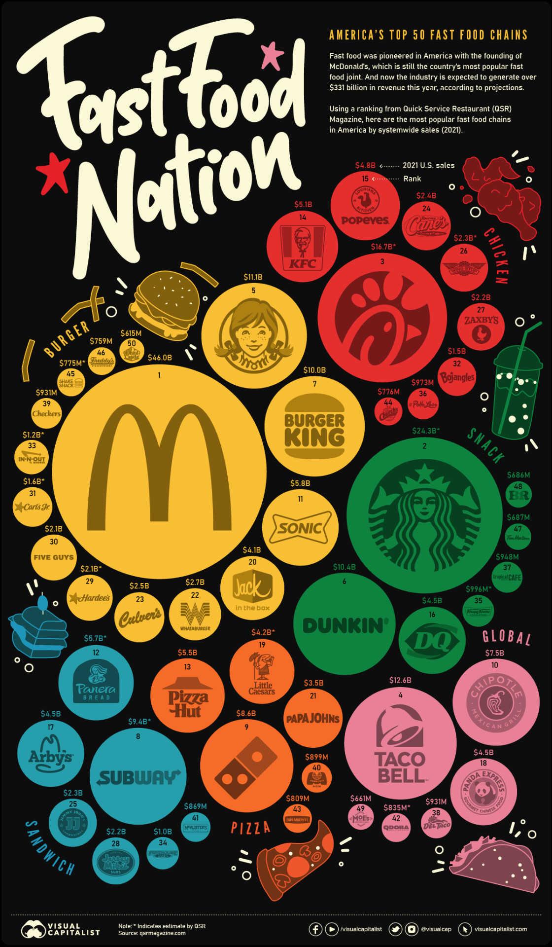
Source: Visual Capitalist
ATL Activity 3 (Research, Communication, and Self-management skills)
Go to the Statista website (www.statista.com/markets/).
In small groups of 2 or 3, decide on an infographic or chart that you could use for to consolidate your understanding of descriptive statistics.
Create a short list of questions / activities for other members of the class to help them with elements of this set of tools.
Swap your activities with other groups and have a go at the activities / answering the questions.
Click the icon below to see a sample created by students at St. Dominic High School, Sint Maarten.
Many thanks to IB educator Saakshi Anil Daryani (Business Management Professor at St. Dominic High School in Sint Maarten) for sharing this with the InThinking Business Management community).

Quartiles refer to the statistical technique of dividing a data set (such as sales revenue data from different stores or branches of large company or IB examination results from a particular IB World School) into four proportionate parts. Quartiles are used to divide a set of data into four equal parts, so each quartile represents one quarter of the data.
Essentially, quartiles are an extended version of the median average in a data set (the median divides the data, arranged in numerical order, into two equal parts whereas quartiles divide this into four parts). However, the median does not tell managers anything about the spread of the data on either side. Using quartiles enables managers to see the spread of values above and below the mean.
Using quartiles allows managers and decision makers to see the distribution of the items in a data set. In the case of IB examination results for the Diploma Programme, the quartiles might be used to show the following for a particular cohort of candidates:

The first quartile (Q1), also known as the lower quartile, shows the data representing the lowest 25% of the candidates’ examination results. It is the number halfway between the lowest number and the middle number in the data set, i.e., it is the middle value of the lower half of the IB scores. Candidates to the left of Q1 represent those in the bottom 25% for the cohort, as measured by their IB score.
The second quartile (Q2), also known as the median, shows the data representing the middle number, halfway between the lowest IB score and the highest IB score in the data set. Hence, Q2 divides the data set into a lower half and an upper half. It shows the value at which 50% of the candidate's IB scores is below the median score.
The third quartile (Q3), also known as the upper quartile, shows the data representing the number halfway between the middle number and the highest number, i.e., it is the middle value of the upper half of the IB scores. This shows the value at which 75% of the candidate's IB scores is below the median score. Candidates to the right of Q3 represent those in the top 25% for the cohort, as measured by their IB score.
The interquartile range (IQR) is a measure of the spread of the data in the set. It is a measure of variability around the median value in the data. Specifically, it is the difference between the 75th percentile (Q3) and the 25th percentile (Q1) of a dataset. The lower the IQR, the fewer the number of outliers in the data.
Note that larger values of the IQR indicate that the central portion of the data (Q2 and Q3) is spread out further. Conversely, smaller values for the IQR show that the middle values are clustered more tightly.
The use of quartiles puts data into context so that they become more comprehensible. For example, it is not possible to determine if a particular candidate scored 34 points in the Diploma Programme. This will depend of numerous factors such as how this score compares with the school's mean, median, or modal averages. If this score puts the candidate in the fourth (top) quartile in the school, this would be a very impressive result. However, if this result puts the candidate in the first (bottom) quartile, it would be far less impressive.
In a business context, a for-profit company might use quartiles to inform its human resource management. For example, salespeople in the top quartile might be awarded a bonus as part of the company's performance-related pay form of financial motivation. The business might fund further training and/or conduct performance appraisal reviews for salespeople in the bottom quartile.
Worked example
A fast food franchise with a chain of nine restaurants has compiled the following data for the past month.
Restaurant | Sales ($'000) |
1 | 8 |
2 | 18 |
3 | 5 |
4 | 15 |
5 | 6 |
6 | 9 |
7 | 21 |
8 | 20 |
9 | 13 |
(a) | From the data above, calculate the 25th percentile. | [2 marks] |
(b) | Determine the 50th percentile. | [2 marks] |
(c) | Calculate the 75th percentile. | [2 marks] |
(d) | Calculate the interquartile range for the data set. | [2 marks] |
Click the icon below to see the working out and answer for each of the above questions.
Answers
(a) From the data above, calculate the 25th percentile. [2 marks]
- The first step is to place the values in numerical order: 5 6 8 9 13 15 18 20 21
- Then determine the median value: 5 6 8 9 13 15 18 20 21
- The 25th percentile is the median value of the lower set of numbers (those to the left of the media):
- 5 6 8 9 = 7
- This means the 25th percentile is $7,000 (i.e., 25% of the restaurants earned less than $7,000 last month, and 75% of the restaurants earned more than this).
Award [1 mark] for the correct answer, and [1 mark] for showing appropriate working out.
(b) Determine the 50th percentile. [2 marks]
The 50th percentile is the median value
5 6 8 9 13 15 18 20 21 = $13,000 (i.e., 50% of the restaurants had sales of less than $13,000 and 50% earned more than this amount last month).
Award [1 mark] for the correct answer, and [1 mark] for showing appropriate working out.
(c) Calculate the 75th percentile. [2 marks]
- The 75th percentile is the median value of the higher set of numbers (those to the right of the media):
- 15 18 20 21 = 19
- This means the 75th percentile is $19,000 (i.e., 25% of the restaurants earned more than $19,000 last month, and 75% of the restaurants earned less than this amount).
Award [1 mark] for the correct answer, and [1 mark] for showing appropriate working out.
(d) Calculate the interquartile range for the data set. [2 marks]
The IQR is the difference between upper quartile (19) and the lower quartile (7)
Hence, the IQR = 19 – 7 = 12 = $12,000
This figure represents the middle 50% of values in the data set. It is more statistically meaningful than using the full range of data, because it omits possible outliers (namely restaurants 3 and 7 in this case).
Award [1 mark] for the correct answer, and [1 mark] for showing appropriate working out. Apply the own figure rule (OFR) as appropriate.
Top tip
For further guidance on the use of quartiles take a look at the Statistics How To webpage, which include a useful quartiles and interquartile range calculator.Standard deviation is a statistical measure of the variation (or dispersion) of a set of values. It allows a business to see the extent to which the values or results from a set of data show divergence from the mean (also called the expected value). For example, in sales forecasting (HL only), a high standard deviation indicates that sales fluctuate significantly from the mean average.
The standard deviation from a data set is represented by the symbol "σ". It shows how numbers within a set of data are spread out or distributed, i.e., whether there is a small or large spread of results in the first instance. The greater the standard deviation, the more spread out the numbers are and the greater the variation from the mean. By contrast, a low standard deviation means that the values in the data set tend to be close to the mean.
The formula for calculating standard deviation is:
σ = √(Σ(x-μ)2/N)
where:
x = an individual data point
μ = mean value of the data set, and
N = the total number of data items in the data set
Managers and entrepreneurs are interested in the spread as it gives an indication of the variation or dispersion (from the mean), which can have a direct impact on their strategic planning and decision making. If the standard deviation is low, this gives businesses greater confidence in their planning. For instance, if a supermarket's average weekly sales revenue is $1.5 million and there is only a small standard deviation, the general manager can go ahead and plan to order stocks and staffing schedules based on this sales figure. By contrast, a large standard deviation would require the business to be far more flexible given the market uncertainties.

Standard deviation is important to effective stock control
As a worked example, consider the data below that shows the weekly sales revenue of five branches of a retailer. Managers can use this data to calculate the standard deviation.
Branch | Sales revenue ($) |
1 | 15,000 |
2 | 50,000 |
3 | 25,000 |
4 | 30,000 |
5 | 30,000 |
To calculate the standard deviation (σ):
Work out the mean average, i.e., (15,000 + 50,000 + 25,000 + 30,000 + 30,000) / 5 = 150,000 / 5 = $30,000.
Calculate the deviations of each data point from the mean average (see table below). For example, the deviation for Branch 2 with the largest sales revenue is $50,000 – $30,000 = +$20,000.
For each data point, square the deviation from the mean. For example, for Branch 1, this 15,0002 = $225,000,000.
Finally, find the square root of the average of the squared differences to determine the standard deviation (σ). In this case, 1 standard variation or deviation from the mean is σ = √130,000,000 = $11,401.#
Branch | Sales | Mean ($'000) | Deviation from mean ($'000) | Squared difference |
1 | 15 | 30 | -15 | 225 |
2 | 50 | 30 | +20 | 400 |
3 | 25 | 30 | -5 | 25 |
4 | 30 | 30 | 0 | 0 |
5 | 30 | 30 | 0 | 0 |
Total | 150 | Average | 130* | |
Mean | 30 | Standard deviation (σ) | 11,401.75 |
* This figure is known as the variance. To calculate the standard deviation, find the square root of the variance.
#Each restaurant deviates from the mean by $11,401.75 on average.
The standard deviation will be larger if the spread of the results is bigger due to greater variations in the data points from the mean (as in this case in the above example). Outliers of a data set (anomalies, irregularities, or extreme values that deviate from the mean) can drastically change the value of σ (standard deviation).
Mathematically, a typical or normal distribution of data dispersed in a data set show that:
68% of the data is less than 1 standard deviation (1SD) away from the mean.
95% of the data is less than two standard deviations (2SD) away from the mean.
99.7% of the data is less than three (3SD) away from the mean.
Theory of Knowledge (TOK)
“You may prove anything by figures” - Thomas Carlyle, Scottish writer (1795 - 1881)
Before answering the above question, watch this entertaining short TED Talk about TED Talks(!), which shows that statistics can reveal whatever you want them to. The video is fittingly titled “Lies, damned lies, and statistics (about TED Talks)”
Top tip!
When analysing numerical data and descriptive statistics, consider the range and not just the various measures of the average. The range in a data set refers to the difference between the highest and the lowest values in the data set. This can enable you to determine the percentage difference between the highest and lowest values to add substance to your analysis.
Top tip!

For the Internal Assessment, students can choose to include primary and/or secondary research. The results of this research can be presented under a section called “Main results and findings”. This section should make clear what the primary and/or secondary research data show. Where appropriate, the findings can supported by use of tables, graphs, and statistics (which are not part of the word count). See page 56 of the Business Management Guide for clarification.
In any case, data (such as infographics, the results of questionnaires, or interview transcripts) should be placed in the appendices, as evidence of data collection. This is also important for academic integrity reasons. However, the analysis of the research data must appear within the main body of the research project.
To test your understanding of this topic, have a go at the following exam practice questions.
Exam Practice Question 1
(a) | Define the term bar chart. | [2 marks] |
(b) | A business has reported the following sales revenue figures over the last 4 months: $50,000, $52,000, $53,000, and $52,000. Calculate the mean average sales revenue for the firm. | [2 marks] |
| (c) | Explain the value of descriptive statistics to senior managers. | [4 marks] |
Answers
(a) Define the term bar chart. [2 marks]
A bar chart is a visual presentation of data, used to compare figures in a study, e.g., sales revenue figures during different time of the year.
Award [1 mark] for a definition that shows some understanding of bar chart.
Award [2 marks] for a definition that shows a clear and accurate understanding of bar chart, similar to the example above.
(b) A business has reported the following sales revenue figures over the last 4 months: $50,000, $52,000, $53,000, and $52,000. Calculate the mean average sales revenue for the firm. [2 marks]
$50,000 + $52,000 + $53,000 + $52,000 = $207,000
Mean average = 207,000 / 4 = $51,750
i.e., the firm’s sales revenue was an average of $51,750 per month for the past 4 months.
(c) Explain the value of descriptive statistics to senior managers. [4 marks]
A major part of a senior manager's role is strategic decision-making. The use of descriptive statistics can help these managers to make decisions in a rational or logical way, based on empirical evidence, in order to minimize risks and maximise opportunities.
Descriptive statistic summarise data to help senior managers to analyse their relevance and significance to the organization and its operations. For example, managers could use average (mean, mode, and/or median) sales figures to measure financial performance or visual tools (such as pie charts, bar charts, and infographics) to support analysis of data or information about the organization's market share, costs, revenue streams, and profits.
Award [1 - 2 marks] for an answer that shows limited understanding of the demands of the question.
Award [3 - 4 marks] for an answer that shows good understanding of the demands of the question, with appropriate use of relevant terminology throughout the response, similar to the example above.
Exam Practice Question 2
The data below show the number of minutes that subscribers spend on a particular educational website on a given day.
25 - 29 minutes: 9 subscribers
30 - 34 minutes: 20 subscribers
35 - 39 minutes: 15 subscribers
40 - 44 minutes: 12 subscribers
45 - 49 minutes: 25 subscribers
50 - 54 minutes: 13 subscribers
54 - 59 minutes: 8 subscribers
Comment on the mode value of minutes spent on the website by the average subscriber. [2 marks]
Answer
In this case, the mode is 45 - 49 minutes as there are 25 subscribers who spend this range of time on the website (a higher frequency than any other in the data set).
This means that the average subscriber spends about 47 minutes on the website.
Award [1 mark] for the correct answer, and [1 mark] for a suitable commentary.
Exam Practice Question 3
The data below shows the unemployment rate for selected countries in Europe and India, for August 2022.
Indicator | Belgium | France | Spain | UK | India |
Unemployment rate | 5.5% | 7.4% | 12.5% | 3.8% | 7.8% |
Source: Trading Economics
Explain two reasons why calculating the mean average for the unemployment rate in Europe and comparing this to the unemployment rate in India is of limited use to managers. [4 marks]
Answers
Possible limitations include an explanation of any two of the following points:
The selected countries are not the only ones in Europe, so the unemployment rates are not necessarily representative of Europe as a whole.
The mean average for Belgium, France, Spain, and the UK = 7.3% which might suggest that unemployment in "Europe" is lower than in India. However, it is clear that the unemployment rate in Spain is significantly higher at 12.5%.
In fact, the unemployment rate in "Europe" is much lower (5.57%) without including the data from Spain. Hence, it is easy to skew averages and interpretation of the figures, which is clearly a limitation to managers.
India's unemployment rate is higher than the rate in 3 of the 4 European countries, yet the averages (7.3% and 7.8%) hardly differ. Again, this highlights a limitation in using mean average figures to inform business decision making.
Although the unemployment rate of India is lower than that of Spain's, the population size of India is much larger (in fact, it is larger than the combined populations of Belgium, France, the UK, and Spain). Hence, despite a lower unemployment rate (than Spain) or a similar unemployment rate based on the mean average for "Europe" (7.3%), the unemployment problem is likely to much larger in India due to the greater number of people affected.
Accept any other relevant and appropriate reason that is clearly explained.
Mark as a 2 + 2.
For each reason, award [1 mark] for a relevant point, and a further [1 mark] for an accurate explanation.
Exam Practice Question 4 - Employee retention
The Mathematics Faculty at an IB World School consists of 10 teachers. Data from the Human Resources department at the school shows the length of service (in number of years) at these teachers have worked at the school:
Alfred = 13 years
Bryan = 7 years
Donna = 11 years
Jacqueline = 19 years
Kim = 2 years
Liam = 17 years
Margaret = 23 years
Paulo = 3 years
Rhia = 5 years
Terry = 29 years
(a) | Calculate the median average number of years that teachers in the Mathematics department have worked at the school. | [2 marks] |
(b) | Calculate the interquartile range. | [2 marks] |
| (c) | Comment on your findings in Question 4(b) above. | [2 marks] |
Answers
(a) Calculate the median average number of years that teachers in the Mathematics department have worked at the school. [2 marks]
First rank the numbers in ascending numerical order: 2, 3, 5, 7, 11, 13, 17, 19, 23, 29
Then determine the middle (median) number. As there are ten teachers in the data set, take the mean average of the two numbers in the middle, i.e., (11 + 13 ) / 2 = 24 / 2 = 12 years
Award [1 mark] for the correct answer, and [1 mark] for showing appropriate working out.
(b) Calculate the interquartile range. [2 marks]
There are 5 values to the left of the median, i.e., 2, 3, 5, 7, and 11
The middle value is 5, so this is the value of Q1
There are 5 values to the right of the median, i.e., 13, 17, 19, 23, and 29
The middle value is 19, so this is the value of Q3
Hence, the IQR = 19 minus 5 = 14 (or 14 years)
Award [1 mark] for the correct answer, and [1 mark] for showing appropriate working out.
(c) Comment on your findings in Question 4(b) above. [2 marks]
The interquartile range (IQR) measures the spread of the middle half of the data in a data set. It is the range for the middle 50% of the sample and shows where most of the values lie.
In this case, the IRQ is 14, as Q1 = 5 and Q3 = 19. This means that approximately 25% off the team have worked at the school for five years or less, and 25% of the teachers have worked at the school for 19 years or more.
Award [1 mark] for an answer that shows some understanding of the demands of the question.
Award [2 marks] for an answer that shows good understanding of the demands of the question.
Exam Practice Question 5
The numbers below show the ages of different employees in the Marketing Department of a business, based on their hierarchical rank in the organization.
56, 39, 23, 40, 23, 23, 21, 29, 23
(a) | Calculate the median age of the workers. | [2 marks] |
(b) | Comment on why the median or mode might be the preferred method of calculating the average over the mean average for this business. |
|
Answers
(a) Calculate the median age of the workers. [2 marks]
First, place the numbers in ascending order: 21, 23, 23, 23, 23, 29, 39, 40, 56
Determine the middle value to get the median value:
21, 23, 23, 23, 23,29, 39, 40, 56Hence, the median age of the staff in the department is 23 (it does not matter there are four people of the this age).
Award [1 mark] for the correct answer, and a further [1 mark] for showing appropriate working out.
(b) Comment on why the median or mode might be the preferred method of calculating the average over the mean average for this business. [2 marks]
In this case, both the median and mode show the average age of the 9 workers in the Marketing Department is 23 years. With the mean, the three people who are not in their twenties pull up the average to 30.8 years (or 31 years old). This is much higher than the median or modal average yet six of the nine workers are younger than this by about 8 years.
Award [1 mark] for an answer that shows some understanding.
Award [2 marks] for an answer that shows good understanding, similar to the example above.
Exam Practice Question 6 - UK cinema box office revenues
The data below, from Statista, show the annual cinema box office revenues in GBP (£m) from 2010 - 2020.

(a) | Calculate the mean value of annual box office revenues for the period 2010 - 2019. | [2 marks] |
(b) | Describe what the data suggest happened in 2020. | [2 marks] |
(c) | Suggest why including the 2020 sales figure to calculate the mean average for the entire period shown is unrepresentative. | [2 marks] |
Answers
(a) Calculate the mean value of annual box office revenues for the period 2010 - 2019. [2 marks]
Mean average = Sum of revenues from 2010 to 2019 / 10 years
Mean = 11,559.5 / 10 = 1,155.95 million
Mean = £1,155,950,000
Award [1 mark] for the correct answer and [1 mark] for showing appropriate working out.
(b) Describe what the data suggest happened in 2020. [2 marks]
The bar chart shows that UK box office sales plummeted from £1,251.8 million to £296.7m, i.e. a sudden and sharp fall of around 76.3% in just a year. This is likely to have been caused by a major adverse change in the external business environment, namely the global COVID-19 pandemic.
Award [1 mark] for identifying the data shows a sudden and sharp fall in box office sales, plus [1 mark] for an appropriate description of the likely reason behind this.
(c) Suggest why including the 2020 sales figure to calculate the mean average for the entire period shown is unrepresentative. [2 marks]
The sales figure in 2020 (£269.7 million) is only about 21.5% of the value of the box office revenues just a year earlier (£1,251.8 million). Including the sudden and sharp fall in box office sales for 2020 (caused by an event beyond the control of the industry as a whole) distorts the mean average box office sales to £1,075.38 million. This would be significantly distorted if only the last two years of data were used to calculate the mean average.
Award [1 mark] for an answer that shows some understanding of the demands of the question.
Award [2 marks] for an answer that suggests why including the 2020 figure is likely to distort the mean average for the period up to 2019 prior to the sudden and sharp fall in the box office sales.
Exam Practice Question 7 - IB Group 3 Subjects
The table below from the IB shows the number of candidates that took examinations in the given Group 3 subjects.
| Year | Bus Man | Econ | Geog | Glo Pol | History | ITGS | Phil | Psych |
| M23 | 30,094 | 27,310 | 8,995 | 7,859 | 45,719 | 2,275 | 4,400 | 26,751 |
Construct a pie chart to represent the above data, showing the percentage share for each subject. [4 marks]
Answer
The total number of candidates = 153,403

Return to the Business Management Toolkit (BMT) homepage
![]()
 Twitter
 Facebook
 LinkedIn