 IB Docs (2) Team

BMT 15 - Simple linear regression (HL only)
/regression---simple-regression-analysis(1).jpeg)
Linear regression models are statistical techniques used to determine the apparent relationship between two variables, such as marketing expenditure and sales revenue or seasonal impacts on the demand for certain goods and services. The DP Business Management syllabus specifies the following three techniques for simple linear regression analysis as part of the Toolkit. Each step is progressive and builds on the previous technique.
Scatter diagrams
Line of best fit, and
Correlation / Extrapolation
Being able to determine correlation helps to improve business decision making and strategic planning.
A scatter diagram is a visual statistical tool used to show the relationship or correlation between two variables, such as marketing expenditure and sales revenues or consumer income and household expenditure levels. This is done by plotting the values of each variable on a different axis, such as the value of marketing expenditure on the horizontal axis (the x-axis or independent axis), and the value of sale revenue on the vertical axis (y-axis or dependency axis).
In theory, the more money a person earns, the more they spend per time period. Market research can be used to determine the extent to which there is a strong correlation between income and expenditure levels. In the scatter diagram below, each dot represents a respondent, with their income shown along the x-axis and their expenditure plotted on the y-axis, per time period.

The graph can then help to determine the degree to which one variable impacts the other. A correlation exists if the scatter diagram shows the two variables being measured are related.
A positive correlation exists if the two variables move in the same direction, such as an increase in advertising expenditure causing a subsequent rise in a firm's sales revenue.
The opposite is true for a negative correlation, such as the demand for warm clothing items is expected to fall during hotter periods of the year.
No correlation exists if there is data set suggests there is no clear or obvious relationship between the two variables being measured or shown in a scatter diagram. This means the relationship between the two variables is inconclusive or unrelated, such as the demand for coffee and the price of umbrellas.
The main advantage of using scatter diagrams is that they can show patterns and therefore correlations in a visual way. The main limitation, however, is that the tool does not reveal causation (the reason or reasons behind the relationship between the two variables under investigation).
/regression---line-of-best-fit.jpeg)
A line of best fit is a statistical technique used to show the relationship or correlation between variables on a scatter diagram. The line of best fit (also known as the regression line) is drawn through the different data points plotted on a scatter graph that evens out variations in the data set.
The line of best fit is used to identify any underlying patterns or relationship between the variables being investigated. However, a line of best fit can only be established if there is positive or negative correlation between the two variables in a scatter diagram.
A strong correlation exists if all of the data points are very close to the line of best fit. This can be a strong positive or a strong negative correlation.
A positive correlation means the two variables being measured move in the same direction, but the data points are not necessarily close to the line of best fit.
A negative correlation exists if the two variables move in the opposite direction, but the data points are not necessarily close to the line of best fit.
There is said to be no correlation between the two variables being measured if a line of best fit cannot be determined.
Hence, a line of best fit is used to indicate the strength of the correlation.
Simple linear regression can also be used to show the trend in a data set, such as a firm's sales revenue over a prolonged period of time. However, as with all statical techniques, it is important to consider what the line of best fit does not show, as it is only an approximation from the given data set. Any readings or interpretations from the line of best fit will be estimations.
Note to teachers:
For IB assessment purposes, HL students will not be expected to calculate the line of best fit. Although the line of best fit can be derived by using a statistical equation, only an approximation is required. You can do this by looking at the data and drawing a straight line that seems to best show the relationship between the data in the scatter graph.
For reference only, the equation to find the line of best fit is:
Y` = bX + A
where,
Y` denotes the predicted value
denotes the slope of the line
X denotes the independent variable, and
A is the y-axis intercept.
Once the scatter points are plotted on a diagram, draw a straight line that passes through as many data points as possible. The line should be as close as possible to all points. For points not on the line of best fit, there should be approximately half the data point above the line, and half below the line.
Top tip!
A key limitation of a correlation shown by a line of best fit is believing there is a causal link between the two variables under investigation, when, in fact, they are not actually related. Always think critically about the data being presented.
/regression---correlation.jpg)
Correlation is used to determine the relationship between data sets. It is a statistical process of establishing a relationship (or connection) between two or more variables. For example, research from the Chinese University of Hong Kong's medical faculty has found that Internet gaming disorders and mental health problems are significantly correlated. In the world of business, correlation is widely used in financial analyses and to support strategic decision making.
Examples of correlation, which can be determined by using simple regression tools, may include:
As the weather gets warmer, the demand for ice cream increases.
The more it rains, the higher the demand for umbrellas.
The more people visit the cinema or movie theatre, the greater the spending on popcorn.
The less a firm spends of marketing, the fewer the number of customers it will have.
Spending more on research and development (R&D) leads to more innovation.
The longer a member of staff works at an organization, the higher their chances are of being promoted to a higher rank.
The greater the spending on staff training the development, the more productive workers become.
An increase in average incomes tends to lead to a higher level of consumer expenditure.
Extrapolation is a statistical forecasting technique that makes future predictions of sales (in units or dollars) based on trends identified from using past data. It works by using a line of best fit (for a particular data set) and extending this line to make predictions, such as future sales revenue.
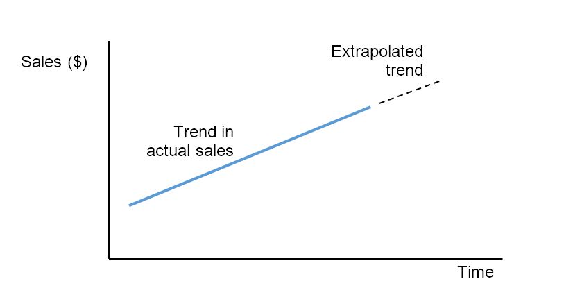
Example of extrapolation of sales data
Note that extrapolation is only effective if the relationship between the dependent and independent variables is linear (i.e. a clear line of best fit can be established).
Other examples of how managers might use simple linear regression to support problem solving and decision making include:
Analyzing survey data to understand indicators such as the degree of customer satisfaction and product preferences (see market research).
Assessing business risks to support decision making (see contingency planning and crisis management).
Building linear regression models for machine learning to support problem solving (see artificial intelligence).
Making sales estimates at different times of the year (see sales forecasting).
Predicting how changes in price is likely to impact consumer behaviour (see price elasticity of demand).
Case Study 1 - The Price of Starbucks Coffee
The range of prices of a Tall Latte from Starbucks in different parts of the world is quite remarkable. The scatter diagram below shows there is a positive correlation between the price of a Starbucks Tall Latte and a country’s gross domestic product (GDP) per capita.
.jpg)
Countries that appear above the line of best fit get relatively bad value for money at Starbucks, while countries placed below the line can afford more lattes with their average income. Countries with a high GDP per capita (or GDP per person), such as Luxembourg and Switzerland, tend to have higher prices. However, the data is not perfect. Cambodia and India, for example, need to pay relatively high prices despite their low GDP per capita.
Read more about the reasons for these findings from The Visual Capitalist.
Case Study 2 - Less in more?
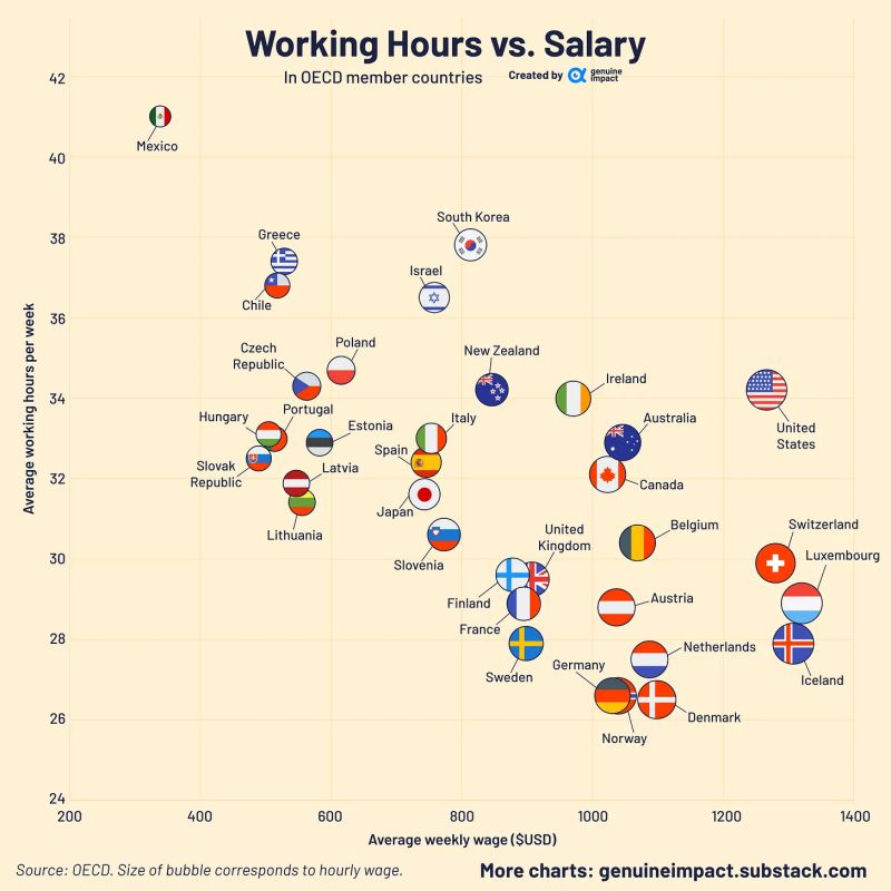
This chart shows that workers in Mexico tend to have the highest average working hours per week and the lowest weekly wage. By contrast, those in Luxembourg and Iceland tend to earn significant more yet work fewer hours per week. The chart suggests there is a strong negative correlation between the average working hours per week and the average weekly wage.
Whilst the chart might provide some valuable insights, it also suggest that people work less to earn more or work more to earn less. But is this really the full picture?
Consider what is not revealed in the scatter diagram above.
As with all two-dimensional tools such as scatter diagrams, there are limitations in terms of what factors are not considered or analysed. Possible considerations could include, but are not limited to the following:
The vastly different tax burdens in those respective countries, i.e., the disposable average weekly wages are not shown in the chart.
How the respective governments spend the tax revenues from these earnings.
Working conditions, beyond working hours, are not revealed in the data set.
Different sampling methods can generate different results, e.g., the hourly wages of gig economy workers who have sporadic hours per job can skew the chart.
The impact of earnings on people's quality of life in these countries.
The cost of living in the respective countries is not included in the data.
Economists and other analysts use alternative indices or measures of social and economic well-being, such as the Happiness Index.
Advantages of simple linear regression
The potential advantages of using simple linear regression include:
Predictive analytics - These statistical tools enable businesses to predict and therefore prepare for risks and opportunities. They are often used by business analysts to make forecasts of future outcomes.
Enhances decision making - Managers and entrepreneurs rely on quantitative data and financial analyses to aid strategic decision making. Simple linear regression techniques enable such analyses to have greater levels of accuracy and trustworthiness, thereby supporting businesses in testing various hypotheses and developing more appropriate strategies.
Reveals new business opportunities - Simple linear regression analysis, such as correlation, can help to reveal new business opportunities that might not have otherwise been available or may have gone unnoticed by decision makers as the information was unavailable. Instead, the tools enable decision makers to gain insights into new business opportunities that can be put to strategic use.
Reduces errors and risk associated with business strategy - Simple linear regression techniques enable business people to test theories, strategies, and hypotheses in order to determine if they are likely to be feasible and successful. Gaining access to the right data helps to have fewer errors, and so reduces risks. As a quantitative BMT, simple linear regression is based on evidence to support decision making, rather than decision makers relying purely on past experiences and/or their own intuition.
Improved management - Overall, simple linear regression techniques help managers and entrepreneurs to manage their businesses more efficiently, such as resource allocation, employee productivity, and budgeting.
Limitations of simple linear regression
The potential limitations of using simple linear regression include:
Cause versus effect - Being able to establish a correlation between two or more variables does not necessarily enable managers to determine the causes of the relationship or connections. For example, there are numerous factors that can cause an increase in the demand for a firm's goods or services, despite its advertising expenditure. Linear regression does not necessarily enable managers to know how a change in one variable causes a change in another variable. See Box 1 for some real-world examples.
Such statistical techniques can be both time consuming and expensive to conduct. A large and representative data set is required to generate meaningful results.
Linear regression is sensitive to outliers. Outliers of a data set refer to anomalies, irregularities, and extreme values that deviate from the other data points. Outliers can drastically change a line of best fit and any corresponding correlation may have a low degree of accuracy.
The past is not indicative of the future - Just because a correlation might be established from a data set does not mean that the trend will continue into the future. For example, the outbreak of the COVID-19 pandemic - which no one could have predicted - caused major havoc to all industries across the world. The chart below shows a positive sales revenue trend for cinemas in the UK, although the coronavirus outbreak soon put an end to that.

The COVID-19 pandemic was a major threat to the survival of cinemas in the UK and elsewhere
Box 1 - Cause versus Effect
Tyler Vigen, a former student at Harvard University, shared the following examples on his website as a reminder to us to look carefully at statistics.

Margarine consumption has a 99.26% correlation with divorce rates in Maine, US.
Total revenue generated by arcades has a 98.51% correlation with Computer Science doctorates awarded in the US.
Worldwide non-commercial space launches has a 78.92% correlation with Sociology doctorates awarded in the US.
The consumption of mozzarella cheese has a 95.82% correlation with Civil Engineering doctorates awarded in the US.
The per capita consumption of chicken has a 89.99% correlation with total US crude oil imports.
Top tip!
Establishing correlation through simple linear regression does not mean a business will always benefit from the results. Indeed, correlations can work unfavourable for a business. For example, if there is inflation in the economy (a sustained rise in the general price level) and subsequently job losses, the business is likely to experience a fall in sales due to the negative impact on consumer spending.
ATL Activity (Thinking and Communication skills)
Discuss why it may be a good idea to use linear regression to predict house prices.
Discuss why it may not be a good idea to use linear regression to predict COVID-19 cases.
As a hint, linear regression may work well for predicting (extrapolating) house prices because the data sets are generally of a linear nature.
Theory of Knowledge (TOK)
Take a look at this BBC article about whether margarine consumption is linked to divorce rates. There is data to suggest a 99% correlation between the two variable, but do we need to be more critical of the statistics that we see? Do statistics and correlation data conceal as much as they reveal?
.jpg)
To test your understanding of this topic (Simple linear regression), have a go at the following true or false quiz.
A scatter diagram can be used to identify the correlation between two variables.
Correlation can be determined from a scatter diagram, such as whether there is a strong or weak positive or negative correlation between the variables.
A scatter diagram can only be used to represent data with a positive correlation.
A scatter diagram can also reveal a negative correlation or indeed no correlation at all between the data variables.
A scatter diagram can be used to determine the cause and effect relationship between two variables.
Scatter diagram may reveal correlations but do not show anything about causation, i.e., what causes the relationship.
A scatter diagram can be used to identify outliers in a data set.
The coordinates in a scatter diagram can show outliers in the data set, if there are any.
A scatter diagram can only be used to represent data with numerical values.
A scatter diagram plots the coordinates of two variables, so numerical values are required.
The line of best fit represents the average relationship between two variables.
The line of best fit cuts through as many of the data points on a scatter diagram as possible. Approximately half of the number of data points not on the line of best fit are above it, with the other half below the linear line of best fit.
The line of best fit is always a straight line.
In simple regression analysis, the line of best fit is linear.
The line of best fit can be used to make predictions about future values.
By extrapolating the line of best fit, predictions can be made.
The line of best fit can be used to determine the cause and effect relationship between two quantitative variables.
The line of best fit does not reveal anything about the possible causes of the relationship shown in a scatter diagram.
Correlation indicates causation.
Correlation is based on the data collected and may reveal relationships between the data variables, but the quantitative data reveal nothing about possible causes.
Correlation can be used to predict future values of a variable.
Correlation shows the extent to which data variables are related. Extrapolation is used to make prediction of future values based on past data.
The line of best fit can be used to determine the cause and effect relationship between two variables.
The line of best fit reveals the extent to which data variables are related, but do not reveal causation.
Correlation can only be determined between quantitative variables.
As a scatter diagram plots the coordinates of numerical values, quantitative values are required.
A scatter diagram is used as a visual tool to show correlation.
Scatter diagrams are visual tools to support problem solving and decision making.
Correlation can be used to determine the strength of a relationship between variables.
Correlations can be strong or weak, positive or negative. It is also possible for a data set to reveal no correlation between the data variables.
Extrapolation is a method of estimating the value of a variable outside of the range of the data.
Extrapolation of future values of a variable can be made if there is a clear correlation in the data set.
Extrapolation is used to predict future values of a variable.
Extrapolating the line of best fit in a scatter diagram is used to make predictions of the values of a variable - if a clear line of best fit exists.
Extrapolation can be used to determine the underlying cause of a pattern or relationship.
Further qualitative research is likely to be used to determine causation of any patterns or relationships in data sets.
Extrapolation should only be used if the pattern of the data is clear from the line of best fit.
If a weak or no correlation is shown in a scatter diagram, there is no value in making any extrapolations.
Extrapolation can be used with both quantitative and qualitative data.
Extrapolation is a method only used for quantitative

Correlation is used to determine the relationship between data sets. It is a statistical process of establishing a relationship (or connection) between two or more variables.
Extrapolation is a sales forecasting technique that makes future predictions of sales (in units or dollars) based on correlations and trends identified from using past data.
The line of best fit is a linear line used to represent the best approximation of a scatter graph of different data points. It is used to study the nature of the relationship between two variables.
Negative correlation exists if the values of one variable in a data set increases whilst the values of another variable in the data set decreases.
Positive correlation exists if the values of both variables in a data set move in the same direction.
A scatter diagram is a visual statistical tool used to show the relationship or correlation between two variables, such as marketing expenditure and sales revenues.
Time series analysis is a statistical technique used to identify trends in historical data, such as the figures for a firm’s monthly sales revenues.

| (a) | Describe the meaning of simple linear regression as a business management tool. | [2 marks] |
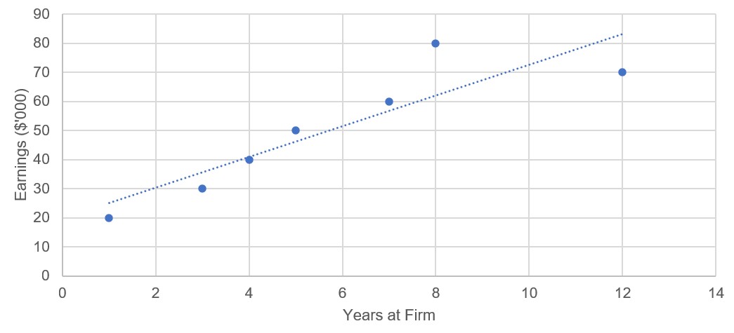
| (b) | The data below represents the earnings of seven employees and how long they have worked at the firm. Plot a suitable scatter diagram to show this data. | [4 marks] |
| Employee | Years at Firm | Earnings ($'000) |
| A | 1 | 20 |
| B | 3 | 30 |
| C | 4 | 40 |
| D | 5 | 50 |
| E | 8 | 80 |
| F | 12 | 70 |
| G | 7 | 60 |
| (c) | Use your scatter diagram to draw the line of best fit. | [1 mark] |
| (d) | Describe the correlation shown by the line of best fit. | [2 marks] |
(a) Describe the meaning of simple linear regression as a business management tool. [2 marks]
Simple linear regression is a BMT that uses statistical techniques to determine the relationship, if any, between two variables, such as a firm's spending on advertising on a particular good or service and the impact this might have on actual sales revenue.
Award [1 mark] for a limited response that shows some understanding of simple linear regression.
Award [2 marks] for a clear and accurate description of simple linear regression, similar to the example above.
(b) The data below represents the earnings of seven employees and how long they have worked at the firm. Plot a suitable scatter diagram to show this data. [4 marks]

Award [1 mark] for each of the axes, drawn to an appropriate scale and correctly labelled.
Award up to a further [2 marks] for a clear and accurately plotted scatter diagram showing all the data points.
(c) Use your scatter diagram to draw the line of best fit. [1 mark]
Award [1 mark] for drawing a line of best fit through the data points on the scatter graph.
(d) Describe the correlation shown by the line of best fit. [2 marks]
The line of best fit shows a strong and positive correlation between the number of years a worker at the firm has been employed for and their respective salary. In general, the longer a person works at the firm, the higher the earnings. There is one outlier (employee E), who has worked at the firm for 8 years and earns the most, although employee F who earns less despite having been with the firm for 12 years.
Award [1 mark] for a limited response that shows some understanding of the demands of the question.
Award [2 marks] for a response that shows good understanding of the demands of the question, similar to the example above.
Return to the Business Management Toolkit (BMT) homepage
![]()
 Twitter
 Facebook
 LinkedIn